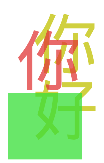
Back in September, I wrote about my wonderful internship with Igalia’s web platform team. I’m thrilled to have since joined Igalia full-time, starting in the very last week of last year. My first project has been implementing the new CSS spelling and grammar features in Chromium. Life has been pretty hectic since Aria and I moved back to Perth, but more on that in another post. For now, let’s step back and review our progress.
The squiggly lines that indicate possible spelling or grammar errors have been a staple of word processing on computers for decades. But on the web, these indicators are powered by the browser, which doesn’t always have the information needed to place and render them most appropriately. For example, authors might want to provide their own grammar checker (placement), or tweak colors to improve contrast (rendering).
To address this, the CSS pseudo and text decoration specs have defined new pseudo-elements ::spelling-error and ::grammar-error, allowing authors to style those indicators, and new text-decoration-line values spelling-error and grammar-error, allowing authors to mark up their text with the same kind of decorations as native indicators.
Contents
- Current status
- CSS unification
- Fifteen years in the making
- Highlight painting
- Processing model
- Stay tuned!
Current status
I’ve sent an Intent to Prototype, as well as requests for positions from Mozilla and Apple.
I’ve landed a patch that paves the way for ::spelling-error + ::grammar-error support internally, and I’m hopefully(!) around halfway done with implementing both the new painting rules and the new processing model.
The spec updates, led by Florian Rivoal, were largely done by the end of 2017. As the first impl of both the features themselves and much of the underlying highlight specs, there were always going to be questions and rough edges to be clarified.
Two issues were raised before we even started, I’ve since sent in another two, and I’ll need to raise at least two more by the time we’re done. I’ve also landed three WPT patches, including three new tests and fixes for countless more.

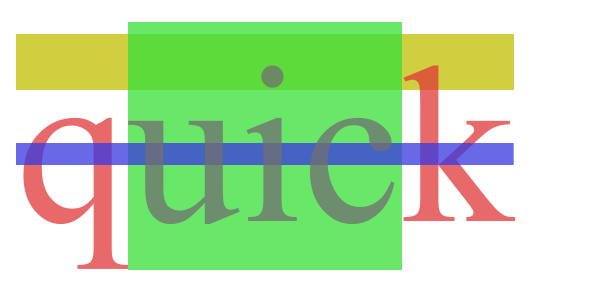
In the course of my work on these features, I’ve already fixed at least two other bugs that weren’t of my own creation, and reported four more:
| 1171741 | Selecting text causes emphasis marks to be painted twice |
|---|---|
| 1172177 | Erroneous viewport-size-dependent clipping of some text shadows |
| 1176649 | text-shadow paints with incorrect offset for vertical scripts in vertical writing modes |
| 1180068 | text-shadow erroneously paints over text proper in mixed upright/sideways fragments |
CJK CSS unification
My colleague Rego noticed that the squiggly lines for spelling and grammar errors look slightly different to a naïve red or green wavy underline.
How, why, and should we unify squiggly and wavy lines?
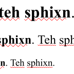
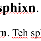
Some further investigation revealed that the two kinds of decorations are drawn very differently with completely separate code paths.
| non-macOS (demo0) | |
|---|---|
 |
 |
| 100% | 200% |
Left (bolder text): nearest wavy decorations.
Right (lighter text): native squiggly lines.
The case for unifying squiggly and wavy lines became a lot more complicated too.
For example, our squiggly lines are actually dots on macOS.
More specifically, they are round dots with an alpha gradient, matching the platform’s native controls.
These details are beyond what can be expressed in terms of a dotted underline, so if we were to unify by making squiggly lines equivalent to such a decoration, we would lose that benefit.
| macOS (demo0) | |
|---|---|
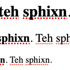 |
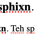 |
| 100% | 200% |
Left (bolder text): nearest dotted decorations.
Right (lighter text): native squiggly lines.
The spec doesn’t require that spelling-error and grammar-error lines be expressible in terms of other decoration lines, so unification won’t block shipping. I decided it would be best to revisit this once I landed some patches and familiarised myself with the code.
Fifteen years in the making
::spelling-error and ::grammar-error are defined as highlight pseudo-elements, together with ::selection and ::target-text. The spec’s processing model and rendering rules are both very different to how ::selection (or ::target-text) has been implemented in any browser so far. Now that we’re implementing more than just the first couple of pseudos, we really ought to comply with the new spec, which complicates our job somewhat.
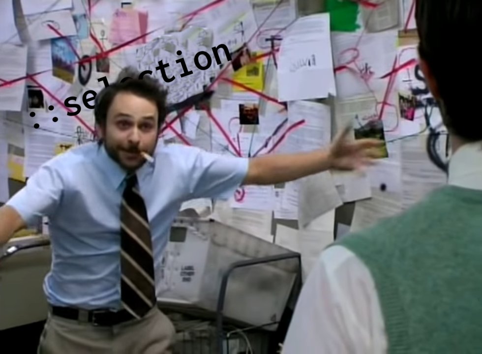
I’ll talk about ::selection a fair bit below, because most of the spec discussion I found happened before the others were defined, going back as far as 2006. Highlight pseudos like ::selection are tricky because they aren’t tree-abiding: the selected parts of the document aren’t generally a child of any one element.
But even then, how hard could it be?
- What is ::selection? How does it interact with other pseudo-elements? Is it a singleton, or does each element have a ::selection pseudo-element? How do we reconcile the ::selection “tree”, if any, with the element tree?
- Can child ::selection styles override parent ::selection styles? What about the child’s “real element” styles? How exactly do parent ::selection styles propagate to child ::selection styles? Do we use a tweaked cascade or tweaked inheritance?
- What happens when authors specify ::selection styles that affect layout? What about styles that rely on how ::selection relates to the element tree, like
outlineor translucentbackground-color? - What happens when child ::selection styles specify only
coloror onlybackground-colorbut not both? Does the other inherit as usual? If we want a special case tying these two properties together, how does it interact with other properties? - Does the ::selection
background-colorpaint over text, or under it? What about “replaced” content like images? If we paint over text, do we need to make the author’s color translucent, and if so, how? - Is text in the ::selection
colorpainted in addition to, or instead of, the same text in its originalcolor? What aboutbackground-color? - Can the default UA stylesheet describe the platform’s ::selection style? How?
- How naughty were browsers that implemented ::selection without a -vendor-prefix before it was standardised? Are vendor prefixes even a good idea?
- Most importantly, how do we introduce a new processing model and rendering rules without breaking existing content?
For answers to most of these questions, check out my notes5.
By the time I started to understand the problem space, two weeks had passed.
Highlight painting
The current spec isolates each highlight pseudo into an “overlay”, and allows each of them to have independent backgrounds, shadows, and other decorations.
Like other browsers, Chromium implemented an older model, where matching ::selection rules are only used to change things like the text color and shadows (except for background-color, which has always been independent).
But the closer I looked, the deeper the problems ran.
Shadows and backgrounds
everyone’s shadow code is complete made-up horseshit but mostly i blame the fact that someone decided to add ‘shadow’ to the (very small!) special list of styles ::selection could modify
— Gankra, 2021
I whipped up a quick demo3 with some backgrounds and shadows, and the result was… not good. “So the originating text shadow (yellow) paints over the ::selection background (grey), except when it paints under, and sometimes it even paints over the text (black)? Why is the ::selection shadow clipped to the ::selection background? What?”


highlight-painting-001.html (based on demo3)
Some of these were easier to fix than others. To fix backgrounds, we essentially push the code that paints the background waaaaay down NGTextFragmentPainter, so that it’s before painting the selected text but after pretty much everything else. We then fix shadows similarly, reordering the text paints from “before with shadows, after with shadows, selected with shadows” to an order that keeps shadows behind text.
These initial fixes are now live in Chromium 90, but we still need to deal with the ::selection shadow clipping. What’s up with that?
Shadow clipping
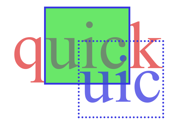
The weird shadow clipping was a side effect of how we ensured that the ::selection text color changes exactly where the ::selection background starts:
- we clip out and paint the selected text in original color, then
- we clip (in) and paint the selected text in ::selection color.
This is useful for both subtle reasons, like ink overflow…
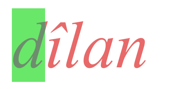
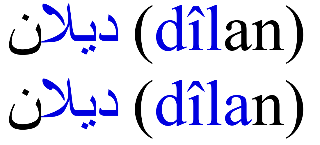
…and not so subtle reasons, like allowing the user to clearly and precisely select graphemes in ligature-heavy languages like Sorani. In this example, یلا is three letters (îla), but only two glyphs. This isn’t explicitly required by any spec, but it’s definitely intentional.
If you use Chromium, you may notice that the ref for that demo appears to select more text. What we’re really doing with ::selection painting is pretending that ligatures are divisible into horizontal parts and guessing how wide each part is. Current font technology just doesn’t provide the metadata to do this more “correctly”.
Firefox always allows splitting ligature styles, including with real elements, and there are at least two good arguments in favour of this approach. Chromium has (reasonably) decided that while the technique is ok for ::selection, perhaps even desirable, it’s not the way to go for ordinary markup.
But anyway, back to the point at hand.
text-shadow means “paint the text again, under the text proper, with these colors and offsets”.
We want to clip the ::selection shadow for the same reasons we clip the text proper in ::selection color, but the coordinates need to be offset for each shadow.
That we don’t is the bug here.
Consensus seems to be that not doing so is undesirable, and in theory, fixing this would be straightforward, but in practice… 😵💫
The first confounding factor was that NGTextFragmentPainter and NGTextPainter were… a tangled mess. Even the owners weren’t sure this was the most helpful architecture:
// TODO(layout-dev): Does this distinction make sense?
class CORE_EXPORT NGTextPainter : public TextPainterBase { /* ... */ }
Years of typographical features have been duct-taped on without a systemic approach to managing complexity, including decorations, shadows, ellipses, background clipping, RTL text, vertical text, ruby text, emphasis marks, print rendering, drag-and-drop rendering, selections, highlights, “markers”, and SVG features like stroke and fill.
A third of the logic was in TextPainterBase, so good luck not breaking legacy. Shadows were painted with a now-deprecated Skia feature called a DrawLooper, which allows you to repeat a procedure a bunch of times with different tweaks, such as canvas transformations and color changes. It’s almost specifically designed for shadows, but it’s technically possible to repeat procedures that have nothing to do with drawing text.
// SkCanvas* canvas;
// SkPaint paint;
// SkScalar x, y;
// sk_sp<SkTextBlob> blob;
// sk_sp<SkDrawLooper> looper;
looper->apply(canvas, paint, [&blob, x, y](SkCanvas* c, const SkPaint& p) {
    // procedure to be looped
    c->drawTextBlob(blob, x, y, p);
});
My solution was based on the observation that loopers draw offset shadows by “moving” the canvas with a transform before each iteration, but transforming the canvas only affects subsequent operations. We were clipping the canvas once, before running the looper, but if we could somehow reclip the canvas after each transform, the clip region would “move” together with each shadow, and we wouldn’t even need to change the coordinates!
I prototyped a fix that seemed to handle everything I threw at it, and informed by the challenges that involved, I also refactored out the code for selections, highlights, and markers. Stephen and I decided that adding clipping as a fixed function to DrawLooper made more sense than adding it to the procedure. At the time, this was true.
The prototype made my most complex test case (at the time) pass, with the exception of ink overflow color, which was a limitation of my ref (both renderings are acceptable).
I then took a couple weeks off to move to Perth.
Vertical vertigo
“Wait… isn’t the original purpose of vertical writing modes, you know, vertical scripts? I wonder if those work as well as horizontal scripts being rotated sideways…”
“…what? Let’s see what they look like without my patch…”
“…what?”
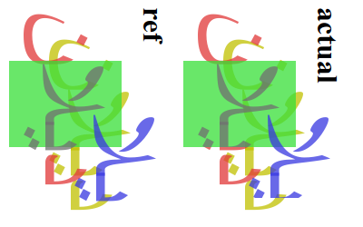
Left: vertical script in vertical-rl, with patch.
Right: same test case, without patch.
Notice how the shadows are offset in the wrong direction. They should be painted southeast of the text proper, but were being painted northeast.
When painting a text fragment with a vertical writing-mode, we rotate the canvas by 90° cw (or ccw for sideways-lr).
This is good for horizontal scripts like Latin or Sorani, because they usually need to be painted sideways.
But for vertical scripts like Han, we usually need to keep the canvas unrotated. A single text fragment can contain text in multiple scripts, so we actually achieve this by rotating the canvas back for the parts in vertical scripts.
So far so good right?
This is what we were doing when painting text with vertical scripts and shadows (example limited to a single script and single shadow for simplicity):
- Let space be our original “physical” coordinate space
- Let offset be the shadow’s offset in space
- Let selection be the selection rect coordinates in space
- Vertical writing mode, so rotate canvas by 90°, yielding space′
- Let offset′ be the result of mapping offset into space′
- Let selection′ be the result of mapping selection into space′
- Old: clip the canvas to selection′
- Configure a DrawLooper that will:
- move the canvas by offset′
- New: clip the canvas to selection′
- draw the text for the shadow
- Vertical script, so rotate canvas back by 90°, yielding space″
- Run the DrawLooper, which carries out the steps above
The looper is told to move and clip the canvas to offset′ and selection′, which are coordinates in space′, but when it eventually tries to do that, the canvas is in space″.
offset′ being in the wrong space is why shadows have always been painted in the wrong place for vertical scripts. By reordering the clip to selection′ so it happens after the rotation to space″, we were now clipping the canvas to the wrong coordinates, which in turn made the text invisible in our demo6!
Cursed
Fixing this again proved harder than it seemed on the surface, because text painting in Chromium involves the coordination of four components: paint, shaping, cc, and Skia.
In paint, the text painters are given a “fragment” of text to be painted in a given style. They know the writing mode, because that’s part of the style, but they know very little about the text itself. The first rotation (for the vertical writing mode) happens here, and we configure the DrawLooper here (except for its procedure, which we pass in shaping).
In shaping, we find the best glyphs for each character, and determine what scripts the text fragment is made of, then split the text into “blobs”.
The second rotation (for the vertical script) happens here, and we throw in a skew transform too if the text we’re painting is oblique (or fake italic, which is again known only to shaping).
In cc, we expose a Skia-like API that can either dispatch to Skia immediately or collect operations into a queue for later. DrawLooper is in the process of being moved here, because the Skia maintainers don’t want it.
Skia provides a stateful canvas, which more or less creates visible output.
With each canvas transform, existing coordinates need to be remapped into the new space before they can be used again, and we were doing them imperatively in two different components. Worse still, while layout (ng) — the phase that happens before paint — uses the type system to enforce correct handling of coordinates (e.g. PhysicalOffset, LogicalRect), the same is not true for paint onwards.
Everything is in PhysicalRect and friends, often erroneously, or in “untyped” coordinates like FloatRect or SkRect.
In one case, a PhysicalOffset is used in both physical and non-physical (rotated for writing-mode) spaces, to refer to two different points at different corners of the text.
Here… let me illustrate.
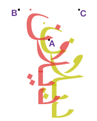
When painting horizontal text in vertical-rl, we rotate the canvas 90° cw around A so that the text’s left descent corner lands on B.
The left ascent corner moves from B to C.
That single variable was used to intentionally refer to both B and C at different times in a function, because the coordinates for B in space happen to be numerically the same as those for C in space′. aaaaaaaAAAAAAAAAAAAA-
-AAAAAAAAAAAAA
To be fair, each of these flaws has a reasonable explanation.
Layout is a confusing place where we constantly need to deal with different coordinate spaces, so ideally we would iron everything out so that paint can work purely in physical space. Half the point of types like LogicalRect is to provide getters and setters for concepts like “inline start” and “block end”.
For most of the things we paint, this is ok, even desirable. Rects like ::selection backgrounds must be painted in physical space, so we can round the coordinates to integers for crisp edges. Text is the only exception: the history of computer typography means that vertical text is, to some extent, seen internally as rotated horizontal text.
DrawLooper is handy for painting shadows, and it might[citation needed] even reduce serialisation overhead in cc. But the way we currently configure them, baking coordinates into them before shaping, makes it even harder to handle vertical text correctly.
Last but not least, Chromium’s pre-standard text painting order was “all rects for highlights and markers first, then all texts”. This made the imperative canvas rotations almost acceptable, if you ignore the shadow bugs, because we didn’t need to rotate the canvas back and forth nearly as many times.
Once I moved to Perth, I spent over three weeks trying to find a systemic solution to these problems, but I just wasn’t getting anywhere meaningful. In the interests of working a bit more breadth-first and avoiding burnout, I’ve shelved highlight painting for now.
Processing model
Let’s return to how computed styles for highlight selectors should work.
The consensus was that parent ::selection styles should somehow propagate to the ::selection styles of their children, so authors can use their existing CSS skills to define both general ::selection styles and more specific styles under certain elements.
This was unlike all existing implementations, where the only selector that worked the way you would expect was ::selection, that is to say, *::selection.
At first, that “somehow” was by tweaking the cascade to take parent ::selection rules into account. Emilio raised performance concerns with this, so the spec was changed, instead tweaking inheritance to make ::selection styles inherit from parent ::selection styles (and never from originating or “real” elements).
This is what I’m working on now.
I’ve got a patch that gets most of the way, first by fixing inherit, then by fixing unset, then with a couple more fixes for styles where the cascade doesn’t yield any value, but there are still a few kinks ahead:
- impl work has raised at least three questions that need CSSWG clarification;
- we need to optimise it, maybe more than before, to avoid perf regressions;
- we still need to check if style invalidation works correctly; and
- we probably want new devtools features to visualise highlight inheritance.
Stay tuned!
Beyond my colleagues at Igalia, special thanks go to Stephen, Rune, Koji (Google), and Emilio (Mozilla) for putting up with all of my questions, not to mention Florian and fantasai from the CSSWG, plus Gankra (Mozilla) for her writing about text rendering, which has proved both inspiring and reassuring.
